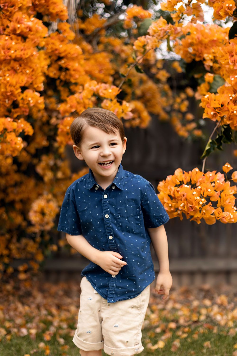
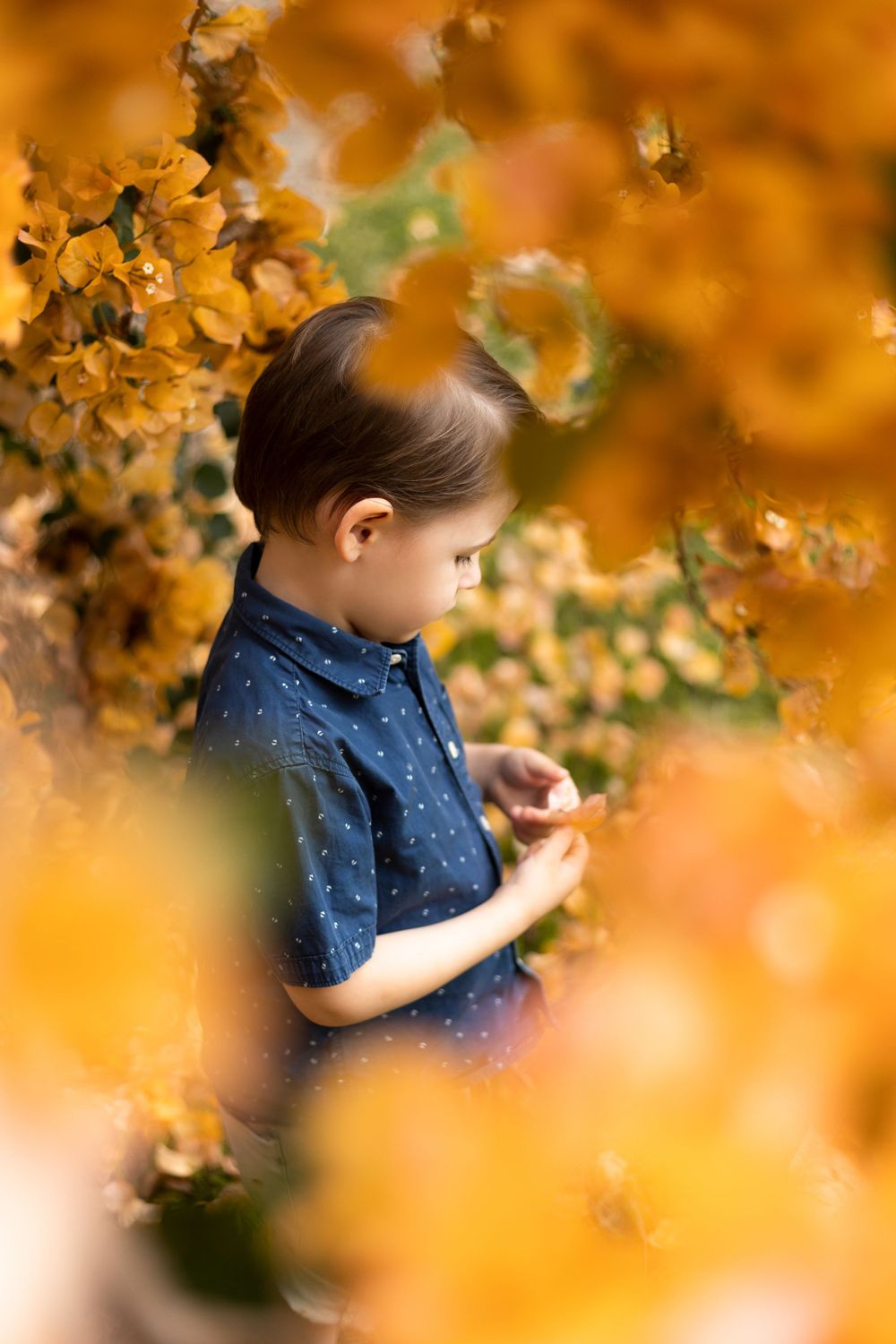
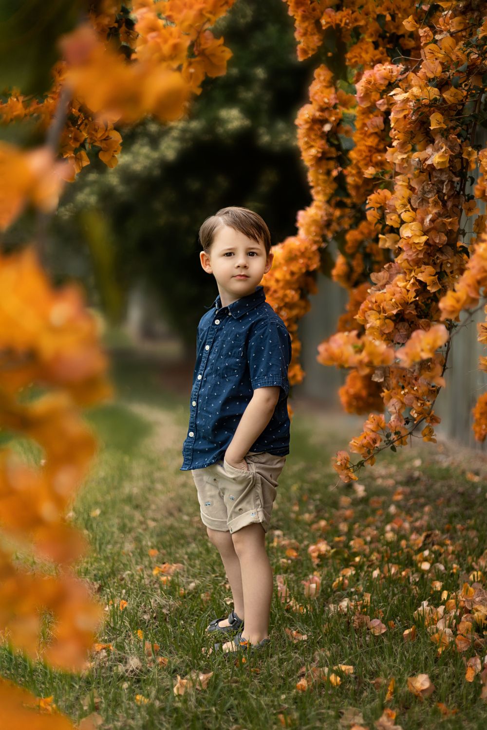
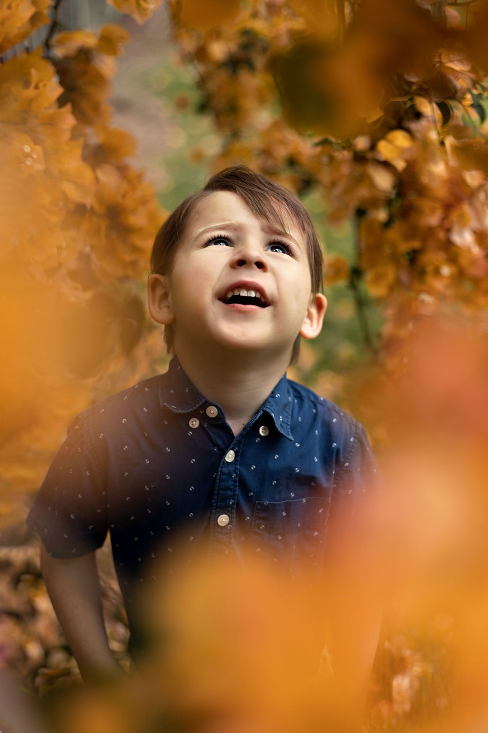
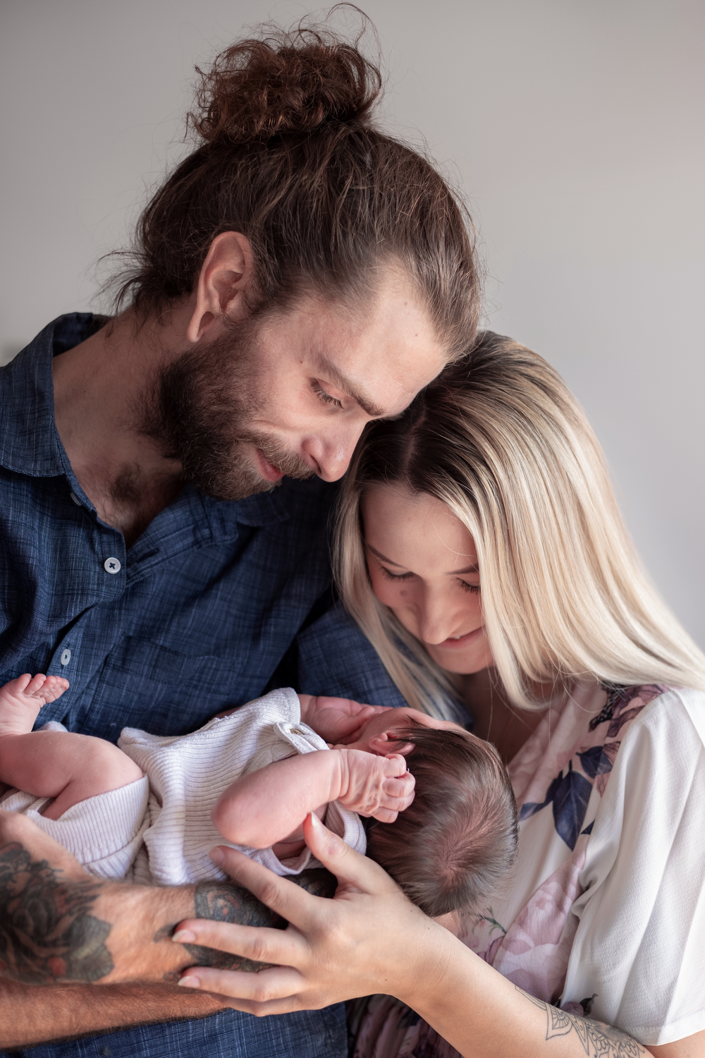
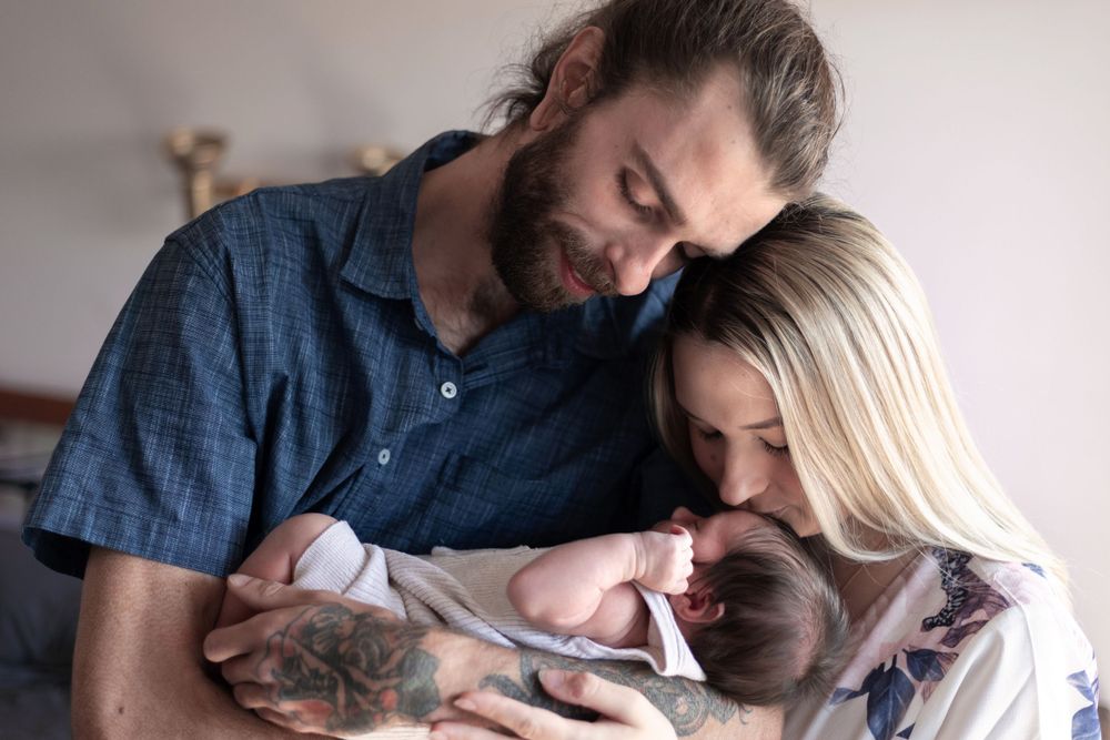
So you have just booked in your photography session, and now you are having a freak out because you realise you need to style everyone for the shoot so they look their best! I know this feeling all too well and, as someone who isn’t particularly ‘stylish’, I have found dressing my own family for photoshoots to be quite stressful. It is a fact though that outfit choice has a big impact on the overall look of your photos. Photography is an investment, and it is a great idea to choose outfits that will give your photographs a classic and timeless feel.
The Basic 'Rules'
Technically there are no rules because this is your shoot and you are welcome to wear whatever you feel comfortable in. But, there are some guidelines that are great to follow if you are looking for your images to have a cohesive, balanced and timeless look to them (which I highly recommend). Now it isn't necessary for you to go and buy a whole new wardrobe for your shoot, unless of course you are looking for an excuse to treat yourself! There is a very good chance that you already have everything (or at least a few core pieces) in your cupboard, and it is the perfect place to start when considering styling your family.
To help you narrow down your options, consider the following as things to avoid when choosing outfits for a photoshoot:
- Avoid large logos, graphic t-shirts or t-shirts with large images or characters;
- Avoid overpowering patterns (yes that absolutely includes hubby's tropical shirt);
- Avoid neon or fluro colours, including big blocks of solid bright colours can be very overwhelming and will quickly become a focal point of your images;
- Avoid matchy matchy outfits. While those 'mummy and me' outfits are absolutely adorable, there is a good chance these outfits will blend together in a photograph and your mini me might blend in instead of stand out. While wearing the same outfits are worth avoiding for a full shoot, I am more than happy for you to include this as an outfit change if you are specifically looking for a co-ordinating 'mummy and me' or 'daddy and me' photo.
Now that we have covered a few things to avoid, I am sure you are wondering what is it that you can wear! The main aim in styling is to achieve a classic and timeless feel so that you continue to love you images regardless of the season of life. To achieve this, look for outfits which include:
- Solid colours or subtle patterns;
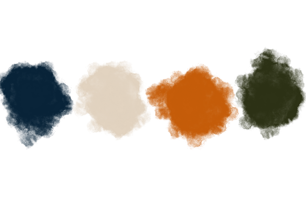
- Choose a colour scheme that works together. Pintrest can be a fantastic source of well coordinated colour schemes! If you have chosen an outfit for one family member, you can search colour schemes on Pintrest that include that colour to help with narrowing down other colours to incorporate when styling your other family members.
- For families it’s best to limit your colour scheme to no more than four colours;
- Consider including textures, flowy clothing items, linen, corduroy and chunky knits for example photograph beautifully.
Bonus tip:- start with your outfit first! There is a very good chance that you are the most excited for your shoot seeing as though you are the one researching and organising everyone. You deserve to look and feel your best and that is why choosing your outfit first can be a great place to start. You can then coordinate your partner or family to suit you and your outfit.
Choosing your Colour Scheme
When thinking about selecting outfits for a photoshoot, the main thing to consider to achieve a balanced and well 'put together' feel is your colour scheme. The most versatile option is to aim for neutrals (i.e white/cream/grey/black) and earthy tones (browns/greens/rust/oranges/mustard/blues etc). These colours usually work with any location you choose, whether it be an in-home or outdoor shoot.
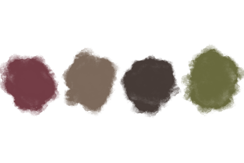
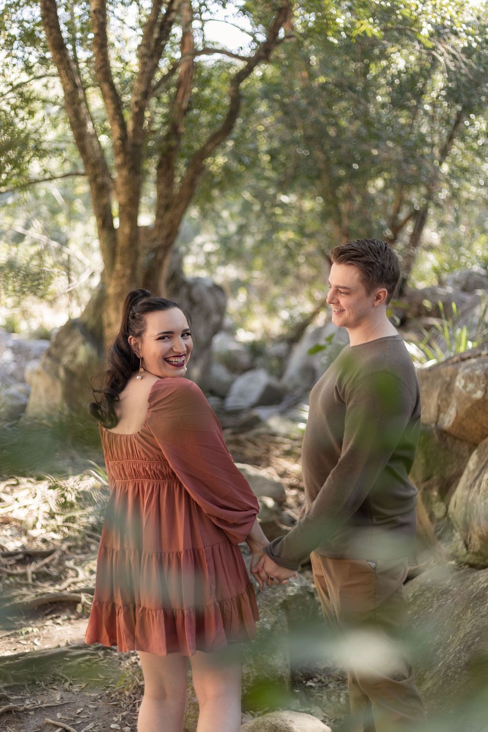
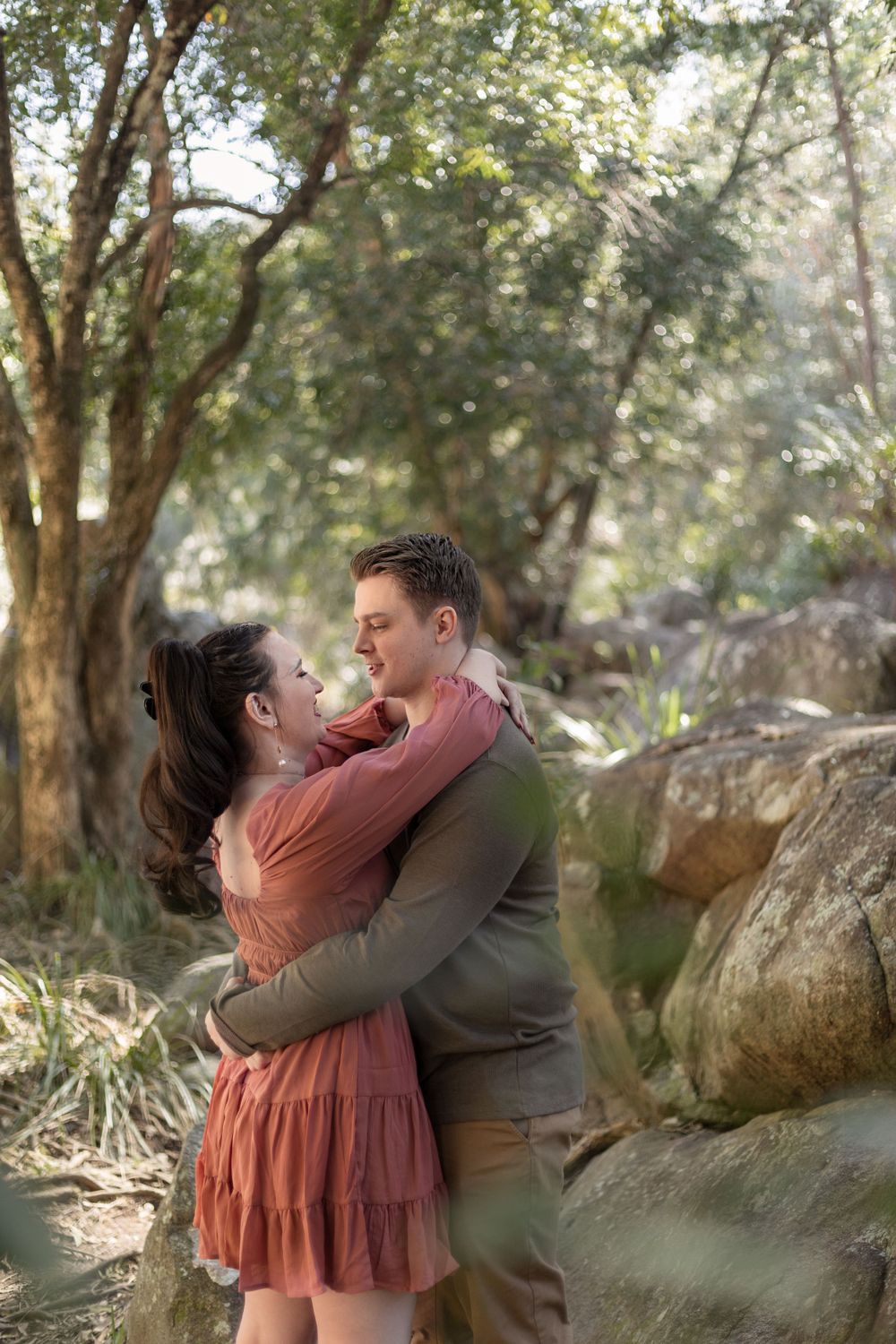
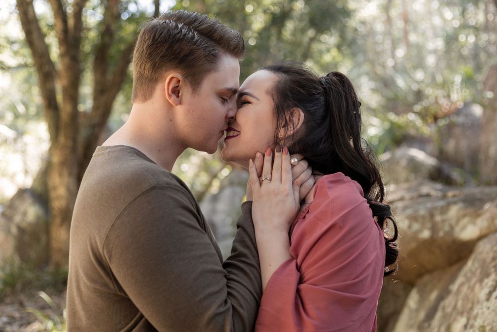
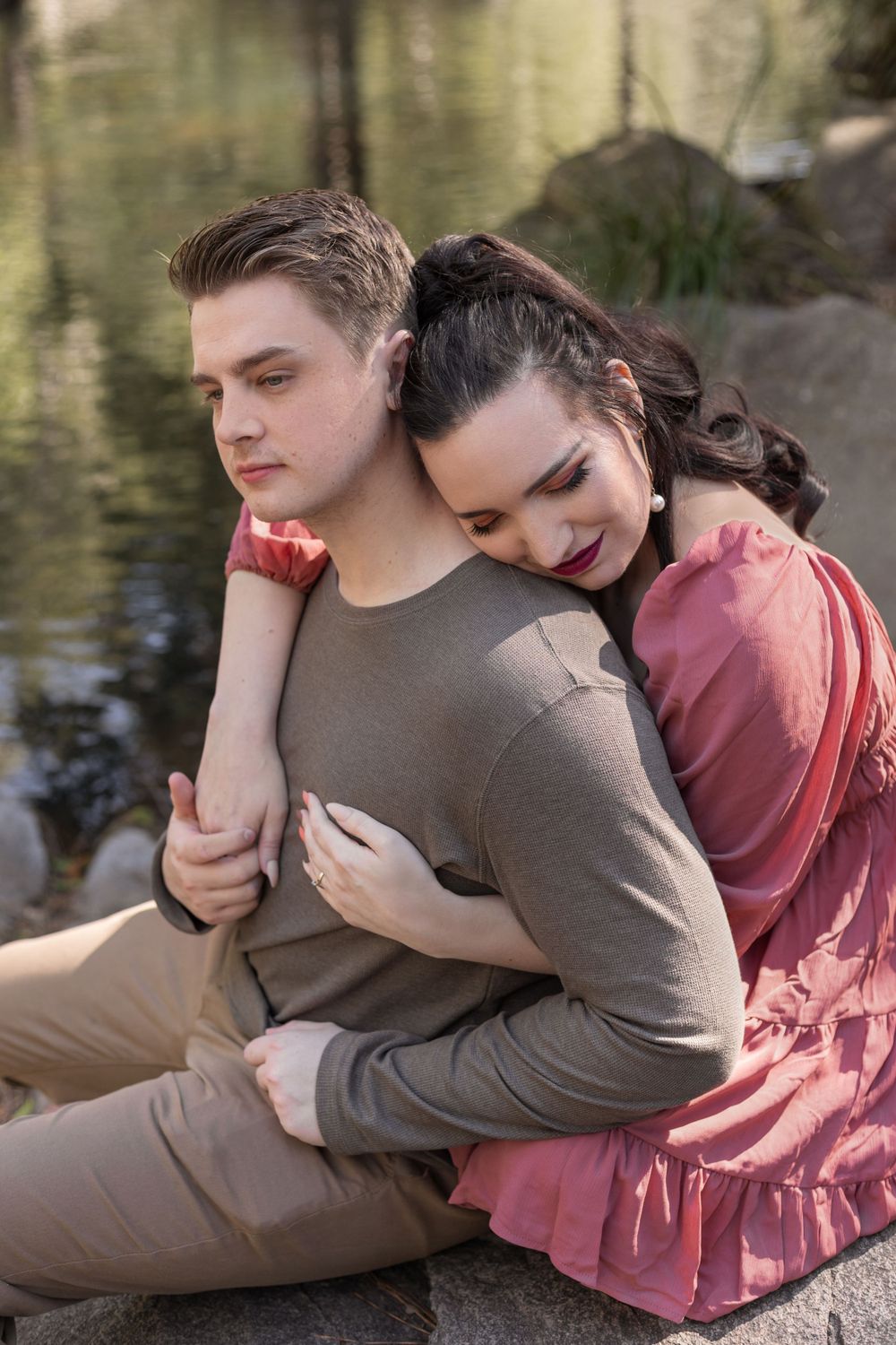
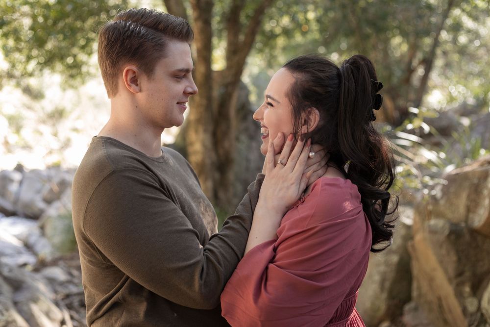
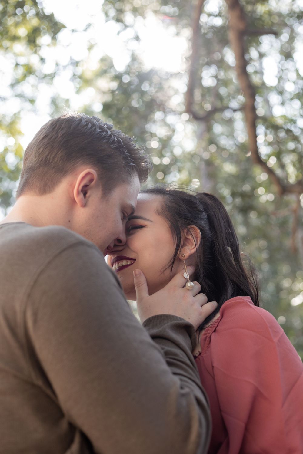
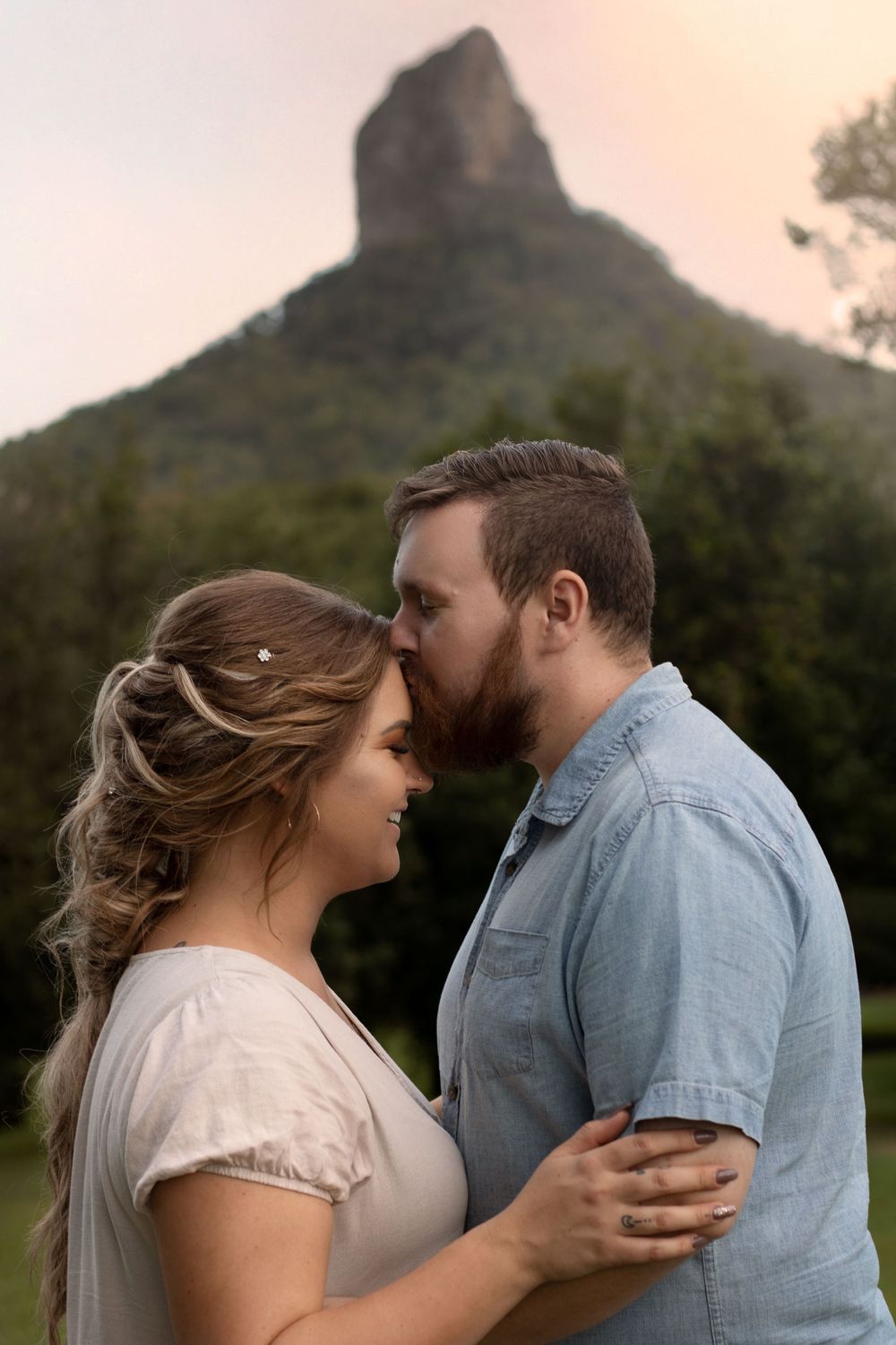
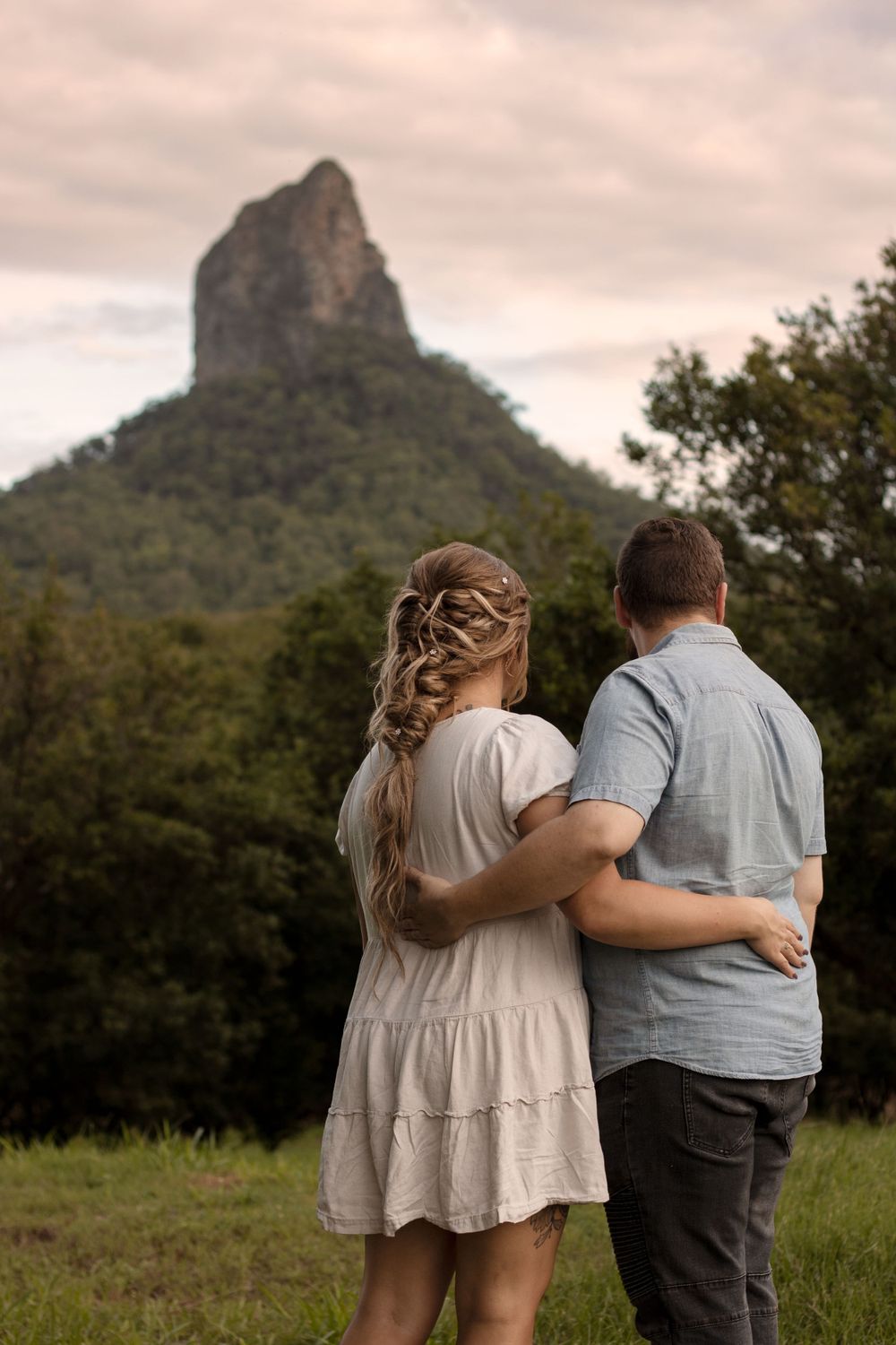
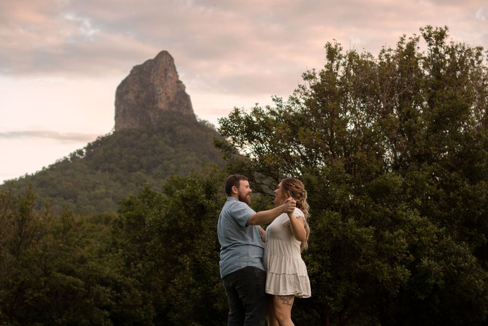
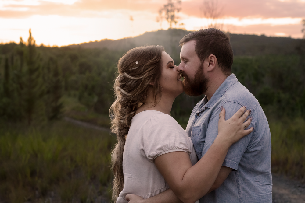
Looking to the location in creating your colour palette is a fantastic idea as you want your entire family's wardrobe to be balanced but also to work with the colours of the environment in which you are being photographed. If you have chosen an outdoor location for your shoot, there is a very good chance that where we are shooting will have a lot of varying greens (unless of course you've selected a beach spot). When shooting in green locations, I encourage clients to choose green clothing pieces sparingly as you run the risk of blending into the background rather than being the focal point of the portrait. Choosing a colour scheme incorporating shades of orange, rust, red, burgundy etc look incredible in locations that are quite green. Shades of blue also photograph beautifully in green locations.
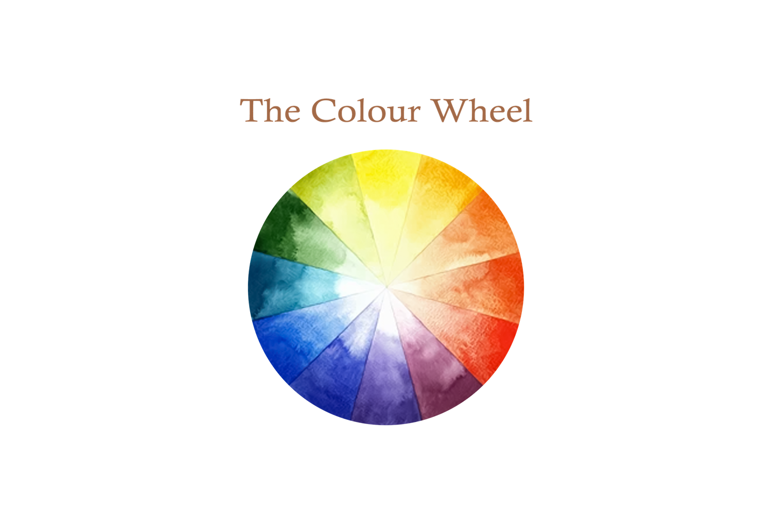
Understanding components of Colour Theory can be helpful to you in coordinating which colours look best styled together. While this isn't necessary, I have included the Colour Wheel below and information about Complementary and Analoguous colour combinations for people who are wanting to go that bit further in understanding why certain colours work so well together.
COMPLEMENTARY COLOURS
Complementary colours do special things for the big picture. These colours, the ones that look incredible together, are called complementary colours. They complement each other and create a visual harmony. Complementary colours sit across from one another on the colour wheel (i.e. blue and orange, red and green, yellow and purple).
That is why incorporating hues of red, such as rust, orange and burgundy, photograph so beautifully in green outdoor landscapes such as grassy fields or forests.
ANALOGOUS COLOURS
Analogous colours are combinations of three colours which all sit next to each other on the colour wheel. These colours have less contrast and result in a much more subtle colour scheme. Think of the jungle and all of the lush variations of green, or the ocean and the infinite hues of blue.
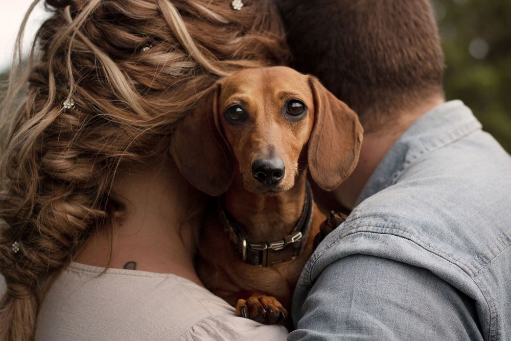
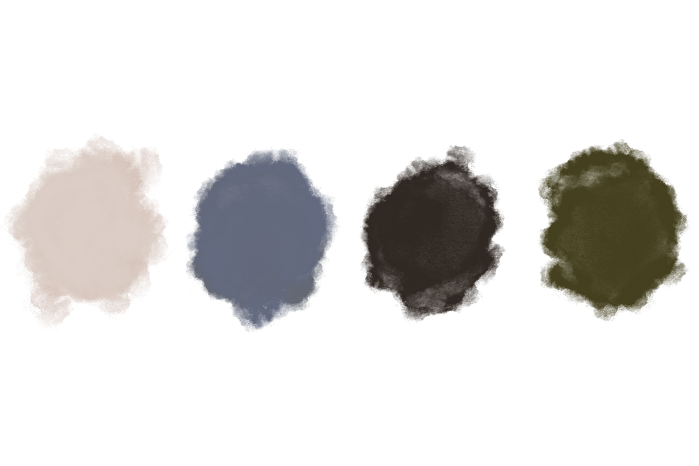
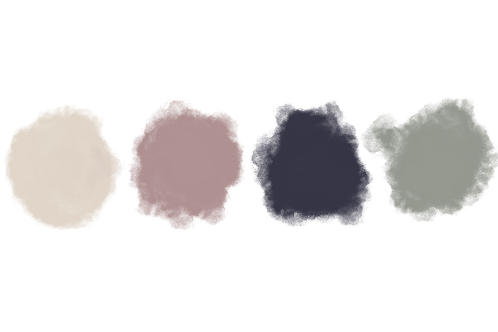
Example Colour Palettes from my Portfolio